

My book has been edited, typeset, and now we have the book cover, and it’s available to preorder too! This is going to be my favourite behind the scenes blog post to write because it’s a visual one and I’m very visual, as you can tell from all the work I put into the website. I love playing around with colours and photos. Some authors just think about the writing, but I prefer to be more hands-on for the entire process and have a vision for the book inside and out from the content to the aesthetic of it to the marketing. In this blog post, we’ll talk about book cover design and the journey to the book cover, including some early design concepts I made. Fair warning: I’m not an artist, but I try my best!
Your options: graphic designer or illustrator?
If you’re going with a hybrid self-publishing company like I am, they might have some in-house graphic designers and illustrators. The standard for book cover design is a graphic designer making your book cover out of stock images from a service like Adobe Stock, Getty Images, Shutterstock, etc. and then putting text and maybe some effects or filters on top. A good graphic designer will make sure that this image is polished, cohesive, and not something slapped together haphazardly. This option will be cheaper than going with an illustrator who will draw you a design from scratch. More often, illustrators will do covers for children’s books, but it doesn’t mean they can’t do covers for other types of books.
Like with any creative thing you may commission (clothes, paintings, drawings, photography, any other art), you should take a look at the portfolio of the illustrator and see if they have the right experience and style for the cover art you desire. If they don’t have the right experience, you may find yourself a guinea pig and that’s no fun. This isn’t to say the artist isn’t talented, but every creative has their specialties and it’s important to be mindful of that so you have the best experience and you get a work of art you’re happy with. You wouldn’t get a salad from a pizza restaurant, they usually suck, so stick to pizza if you’re going to a pizza place. However, a salad from a whole foods plant based vegan restaurant might be pretty good.
Alternatively, you can always hire an illustrator or graphic designer independently if you’re not happy with any of the options, just keep in mind the file requirements.
What did I pick?
Ultimately, I went with the in-house graphic designer because I pretty much put together the mockups for the design myself on Photoshop with pictures I found on the internet, and you’ll see those later in the blog post. I didn’t find any of the in-house illustrators had the right experience and art style for me and I couldn’t justify the price. So I had a look at Adobe Stock and found some images that convey exactly what I’m looking for at a fraction of the price of an illustrator drawing it from scratch. When I saw the cover design that the graphic designer put together it exceeded my expectations and it was something I was proud to put my name on. Your publisher will pass on the costs of licensing the stock images to you, so keep your budget in mind when looking for images to use for your book cover.
The Evolution of the Crime of the Century book cover:
The idea for Crime of the Century was born in 2021 and with this book being almost 3 years in the making, I had a few different ideas for the book cover before settling on the final one. A lot of things inspired me during that time and this book cover went through a few different phases for the look.
What these all had in common was a vintage look, classic rock inspiration, and some amount red in the design. Red is the colour of blood and with it being a true crime book, I had to make something on the cover red. Now let’s talk about my thought process and inspirations along the way. These mockups were designed by me. I am not a trained graphic designer, just someone who likes playing around with photoshop in their spare time!
Earliest design: inspired by its namesake


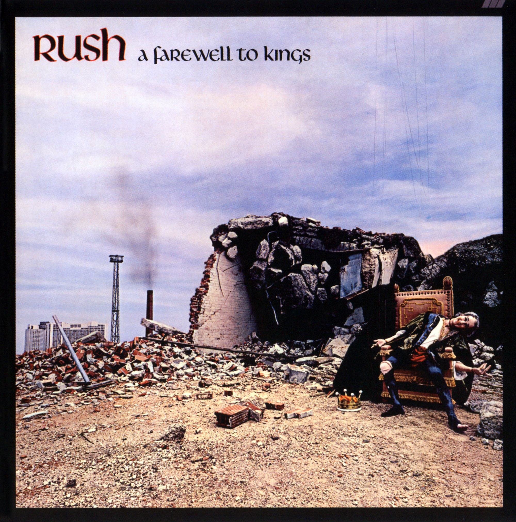
Classic rock fans will recognise the book’s title as the title of a Supertramp album that turns 50 this year! So the first inspiration was the album cover of Crime of the Century, jail bars floating in space – logical, right? I love galaxy prints and outer space motifs, so I thought it would have been a cool look for the book. Instead of jail bars, I thought it would be cool to have an investigator’s cork board like you see in those detective shows or murder mystery shows or like that one Pepe Silvia scene in It’s Always Sunny. The text being in red was a no-brainer for me and I loved the idea of this Celtic font and the symbolism behind it because I wrote the book while living in Ireland and I wanted a piece of that to be on the cover. However, this font looks a little random and some of the letters aren’t the easiest to read. Some people might even think the font looks a bit Lord of the Rings, not a bad thing, but not the most classic rock looking font. However, John Entwistle used a similar font for Rigor Mortis Sets In and Rush used a similar font for A Farewell to Kings. This design idea was something I came up with in early 2022.

The problem with this design? The corkboard looks too busy for a front cover. So back to the drawing board we go!
Design Two: Victorian influences, a little closer to the final one, but not quite!


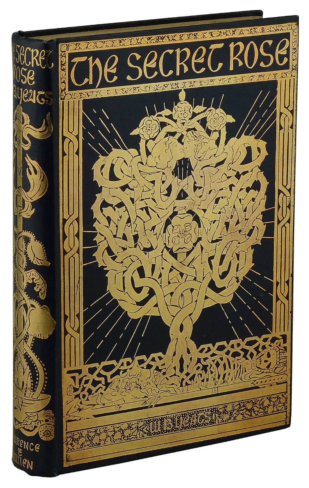

About a year later, I came up with this idea after seeing a photo of Victorian books on a shelf on Twitter and this completely changed me! I always loved old things and I think aesthetically, books looked best during that time and I wish books looked like that again. I love how in that time period they made ordinary objects look artistic and I love this philosophy. Like it or not, the book’s appearance is important and gives a first impression and I want that first impression to be a great one. I wanted this book to look so appealing and a standout on the shelf that even those who aren’t into classic rock or true crime might be intrigued and make the purchase. Or they’d at least buy it as an art piece! Art for art’s sake like 10cc once sang. I loved the idea of this book looking like it came out of an old haunted mansion. As a child I remember that near my dad’s workplace there was this old blue Victorian house with a big front porch that wrapped around the house and I loved how it looked because it was so different from the modern house I grew up in. It had a charm and wasn’t like those neighbourhoods of soulless cookie cutter McMansions. Make everything aesthetic again is what I think! So that was the main inspiration was books of the 19th century, and you can see a couple examples above that inspired me.
The Irish influence in the aesthetic shows up even more prominently here, keeping the same font as in the first design, but you can really see it in other elements. I took inspiration from my surroundings: the gravestones that I’d see in the cemeteries and a nod to Ireland’s literary heritage. The old Victorian book cover that inspired me the most was the one for William Butler Yeats’ The Secret Rose, designed by Althea Gyles in 1897: the font, the frame, just perfect! Now to make it a little more rock and roll…
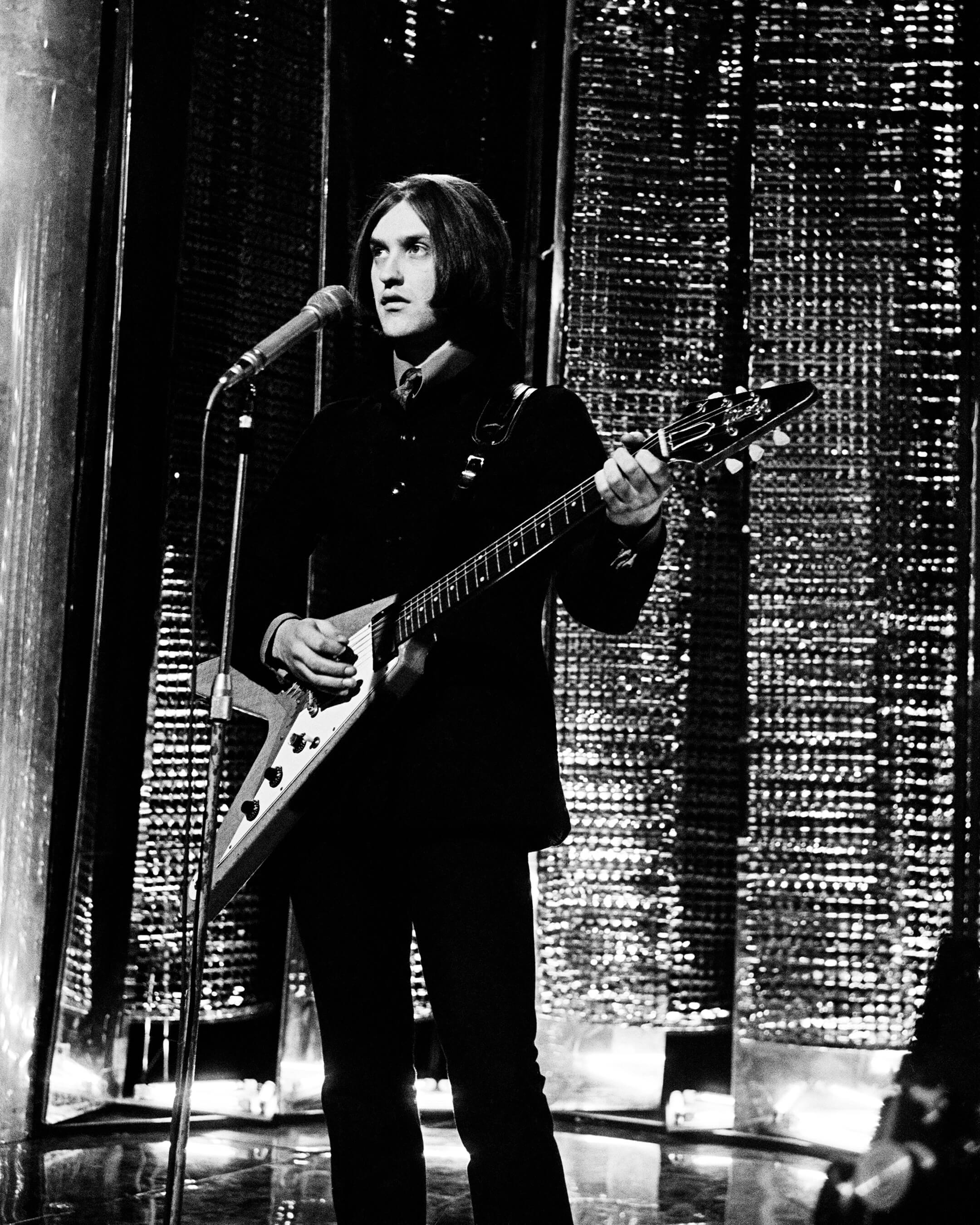
And that’s where the bloody Flying V comes in. Lizzie Borden meets classic rock! Two chapters in the book talk about The Kinks. Oh great another Kinks reference! But hear me out. Dave Davies was one of the first guitarists to popularise the Flying V. During their first US tour, Dave was playing a loaned custom built Guild guitar that once belonged to George Harrison until it was stolen while en route to Los Angeles, where they were to shoot something for the musical variety show Shindig!. Thankfully Los Angeles had some great guitar shops and one of the show runners took Dave to a guitar shop to get him a new guitar. Dave Davies being a stylish one, he wasn’t just going to go for any old guitar. He noticed a triangular shaped guitar case that stood out in the sea of rectangular ones and told the shop assistant he wanted to take a look at it. At the time, the Gibson Flying V was a novelty futuristic looking guitar designed in the 50s and not seen as anything special. When Gibson started selling the guitar in 1958, it was a flop with fewer than 100 manufactured and sold in that initial run. However, the future generations of guitarists loved it. To quote Marty McFly in Back to the Future, “I guess you guys aren’t ready for that yet. But your kids are gonna love it.” And that’s exactly what happened! You could say it’s one of the greatest rock and roll flops of all time! After Dave Davies showed off his new guitar on Shindig!, other rockers soon followed and bought one for themselves: Keith Richards, Jimi Hendrix, Marc Bolan, Leslie West, Billy Gibbons, Michael Schenker, Paul Stanley, Eddie Van Halen, James Hetfield, and Kirk Hammett. Other guitar makers even started making guitars with a similar shape like Eko (as played by English-Italian rock band The Rokes) and Dean (who have a Michael Amott Tyrant X model that has some red splatters on it like my book cover – I promise you I didn’t know of the existence of this guitar until after the fact).
Here’s Dave and his Flying V in the 60s:

The problem with this design? I couldn’t find a good Celtic looking border motif that worked for the cover because they were too thick and wouldn’t allow enough space for the title and the bloody Flying V. Am I really going to spend money on a custom designed Celtic knot looking border? Is that worth the money? I don’t think so. As well, no Irish musicians are mentioned in this book (although there’s going to be one Irish band mentioned in volume 2), so it’s a bit random of a theme. I also couldn’t find a good font on Adobe fonts either. It’s still a sick looking design though and I’m quite proud of the mockup I made! Close to what I wanted, but I think we need to go back to the drawing board one more time!
The aha moment!: One more classic rock easter egg?

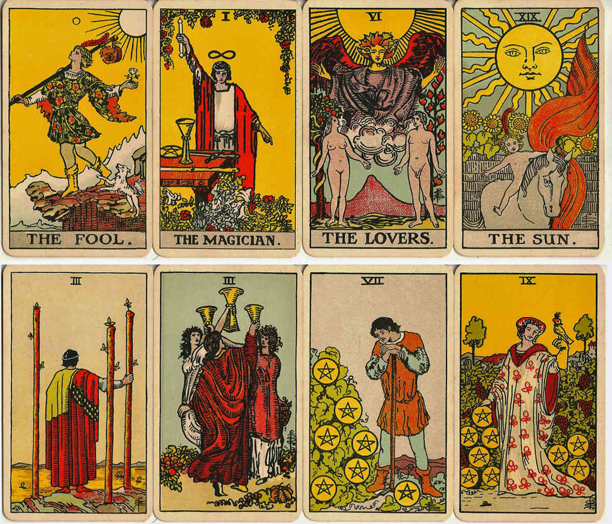

Well as they say, third time’s the charm! I decided to have a look for some frames and borders for the book cover and I looked at the typical Art Nouveau ones and was like ‘next, next, next!’ None of it was giving old Victorian book cover like I wanted.
The search was fruitless at first, until I thought about other themes and one of my book promo ideas. I wanted a gothic, occult feel for my book and tarot cards fit that theme. I remembered that I was going to film a promo for Crime of the Century (you can watch it here on Instagram) recreating one of the events in the book: Joe Meek going to a tarot card reading sometime in January 1958 and the fortune teller predicting the day of Buddy Holly’s death: 3 February (he did indeed die on that date, but in 1959). Crazy story, but true!
The tarot card look is a nod to that and I wanted to keep that bloody Flying V – that element was perfect and all of my friends I shared the prototype designs with loved it. I wanted to keep the blood on the book cover minimalistic because less is more and when someone commits a murder, they hide the evidence. The funniest thing is that the book publisher wanted more blood on the cover, when I was totally expecting they’d say absolutely not to any blood!
I was lucky enough to not need an illustrator for the bloody Flying V because I found a silhouette of one on a stock image site and there you go! Two classic rock references on one book cover: The Kinks and Joe Meek! Just so happens that there’s an LGBT connection there too: Joe Meek was gay and Dave Davies is bisexual. Yours truly, the author of this book, is bisexual too!

It gets even crazier when you look at the numbers and dates – numerology type of stuff. The Flying V originally came out in 1958 with the patent for it being filed on 7 January 1958. Like I said earlier, that was around the time of the tarot card reading that accurately predicted the day of Buddy Holly’s death – 3 February. Guess whose birthday is on 3 February? Dave Davies of The Kinks. When did Joe Meek kill his landlady before turning the gun on himself? 3 February. What is up with all of these coincidences? This is wild and that’s what my book, and my work in general, is all about, finding connections and coincidences where you wouldn’t expect them.
Originally I wanted the book to be a navy blue, but I loved the gold tarot card look and my favourite colour is purple and I said that’s it, I want the book to be purple. Of course with my name being Angie Moon, as soon as I saw this tarot card design with moons in the corners, I knew it was perfect, felt like it was made for me. Overall I’m so happy with how the book cover came out. It’s everything I dreamed of. I hope you like it too.
Until next time!
Loved this blog post and want to support and see more? Donate to The Diversity of Classic Rock on Patreon or Paypal or follow me on Facebook, Twitter, or Instagram, click the follow button on my website, leave a nice comment, send your music or classic rock related books for review, or donate your art and writing talents to the blog. Thank you for the support!

I enjoyed watching the evolution of the cover. A friend wrote a novel years ago and the publisher chose the cover design – a mistake in my eyes. While the original Flying V may have been a commercial failure, the great Albert King was an early adopter.
LikeLiked by 1 person
Thank you! I think it’s good to be hands on with the whole process. While it would have been much kinder to my wallet to go with a traditional publisher, the positive side of self-publishing is I got to have more creative control. I wouldn’t want my name on something where the cover is something I didn’t want at all. And yes, Albert King and Lonnie Mack were two early adopters!
LikeLiked by 1 person
I have been busy as of late, but I am really happy to see how far this book has come. Definitely will keep an eye out for it once it is released!
LikeLiked by 1 person
Thank you Conor!
LikeLike
Interesting. I like the cover but I didn’t not like the original murder board. Busy, but more to-the-point I think.
LikeLike
Yeah with book covers less is more!
LikeLiked by 1 person
The cover looks cool, Angie. The way you got there is also an interesting read! 🙂
LikeLiked by 1 person
Thank you!
LikeLiked by 1 person
[…] I’ve been really into mid-late 19th century art and that influenced the creative process and design of the book cover for Crime of the Century (available to buy now and the books should be arriving at my house this […]
LikeLike
[…] In Philadelphia, the famous ‘Pepe Silvia’ scene. Now you see what I was getting at in my book cover design blog post where I said I was going to use that conspiracy theory board idea somewhere else, and here it is! […]
LikeLike
[…] than the best so I made sure to put all my energy into this book from the content inside it to the artistic approach I took coming up with the book cover. Writing the book was a journey and the content is a storytelling journey through classic rock and […]
LikeLike